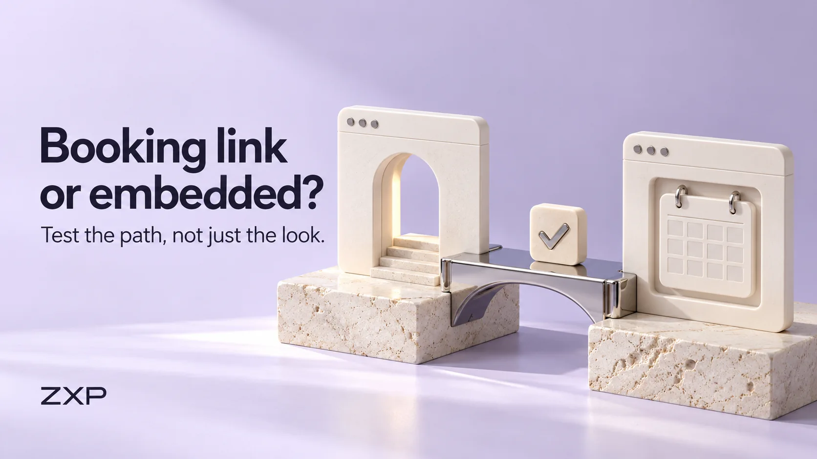
Your business has chosen a booking service that fits its appointments. Now the website needs to get visitors into the right calendar. Should a button take them to the provider’s booking page, or should the scheduler sit inside your own page? Choose by checking the complete route: what works on a phone, which service the visitor reaches, how a failure is handled and what confirms the result.
An embedded calendar can look well integrated, but appearance is only one part of that decision. A plain booking link can be the better choice when it gives visitors a clearer, more dependable way to finish. Neither route deserves approval just because the first screen loads.
Compare the two placements
A direct link takes the visitor to a booking page. An embed displays the provider’s scheduler within a page on your website. Check which options your chosen provider currently supports and what your website can accommodate before asking a designer to implement either one.
| Route | Potential advantage | What to check |
|---|---|---|
| Direct booking link | The scheduler has its own page and available screen space. | Does the destination identify the business and correct service? Is the change of site or tab understandable? |
| Embedded scheduler | Service information can remain beside or above the calendar. | Can visitors use every step within the available space? Is there a usable route if embedded content fails? |
| Embed with a separate direct link | Visitors have another route if the embedded view is unusable. | Does that link reach the intended service, and does it remain visible outside the failing frame? |
For a specific example, Skedda documents both simple links and embedded schedulers. Its guidance notes that a poorly optimised host page can hurt the mobile embed experience, and some browsers may require users to open the scheduler directly. Those are Skedda’s documented constraints, not a claim about every provider or a recommendation to change systems.
Keep the appointment context clear
Before the visitor leaves the service page, explain what they are booking and where it happens. Carry the relevant service, location and time-zone information into the booking route where the provider supports it. If the visitor must choose those details again, make that step apparent instead of implying that the website has already selected them.
Check every prominent booking link rather than assuming they all share a destination. A homepage button might open a general service menu while a specialist page should lead to a narrower choice. Record the intended destination beside each entry point so that a later service change does not leave old links in circulation.
Give the button a useful label, such as “Choose a studio visit”, when that accurately describes the next step. If it opens another site or tab, make the handoff understandable. Avoid promising an appointment before the provider’s actual confirmation step has happened.
Check the route on a phone
Start on the real service page and follow the same route a customer would use. On a phone, check whether the calendar fits, whether dates and controls remain readable, and whether the on-screen keyboard obscures the next action. Try going back to change a choice. Note any unexpected reset, clipped message or confusing scroll area.
Include keyboard operation and enlarged text in the agreed review. These checks can reveal practical barriers, but they do not amount to a complete accessibility assessment. A desktop preview squeezed into a narrow window is also different from trying the actual browser on a phone; record the device and method honestly.
Keep the recovery route outside the embedded area. A separate link labelled “Open the booking page” can help when the frame is blank or unusable. It will not fix an outage at the booking provider itself. For that situation, explain the business’s real alternative contact method without suggesting that a call or message reserves a time automatically.
Use a small acceptance sheet
Imagine a fictional bicycle workshop that has already decided customers may book an assessment visit directly. The examples below are invented planning scenarios, not observations from a real scheduler, a ZXP client or a completed test. The workshop is comparing website placements, not changing what the appointment includes.
| Check | Example concern | Evidence needed before acceptance |
|---|---|---|
| Phone usability | The embedded date selector might be difficult to use in a narrow column. | Record the actual device, route and whether all required controls can be used. |
| Correct service and place | A general calendar could leave the visitor unsure which workshop to choose. | Confirm the destination and final summary identify the intended assessment and location. |
| Failure recovery | A blank embed could leave the visitor with no next step. | Check that a separate booking link remains reachable; document the alternative if the provider is unavailable. |
| Booking result | A successful-looking screen could still leave the outcome unclear. | Under an authorised test plan, compare the visitor’s confirmation with the receiving system’s record. |
Add the page address, person responsible and unresolved issue to your own sheet. Keep a failed or untested check open. A note saying “button works” does not show whether the right appointment was selected or whether a usable result reached the business.
Verify the result without creating unwanted appointments
W3C’s form-notification guidance calls for clear success and error feedback, including instructions for correcting mistakes. Apply that principle to the booking journey: visitors should understand whether they have confirmed an appointment, sent a request or still need to correct something.
Agree the test environment, fictional details and controlled destination with the business and provider before submitting anything. Do not casually create a live appointment, charge a payment method or send a real customer a notification. If live verification is necessary, obtain explicit agreement on the actions and on how any test record will be handled.
Compare the displayed outcome with the receiving record and expected notification in that authorised test. A preview demonstration cannot prove that live delivery works. If a real submission’s outcome is uncertain, follow the business’s support process before retrying and risking a duplicate.
Choose the route you can maintain
Choose the simplest placement that passes the agreed checks. If the link works clearly and the embed remains awkward, keep the link. If the embed works well, retain a useful recovery option. Revisit the checks when the provider, appointment choices or website layout changes.
When discussing ZXP’s website services, bring the provider’s documentation, the pages that need booking links and your acceptance sheet. Confirm the integration scope and testing responsibilities before work begins; a website package alone does not establish support for a particular booking system.
Sources & references
- 01Embed Skedda or AllBooked on your website
Skedda Support
- 02User Notification
W3C Web Accessibility Initiative
A perspective from the ZXP team.
Designed to help you ask better questions and take a clearer next step.